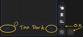
This is not a show stopper. IMO, it is a UI improvement.
I use dark mode at times at night. I couldn’t see the add folder icon very well in the Items sidebar.
Compare to this forum. The “dark” text is still easy to read, and even lighter than the undo arrow.

The feature request is to lighten the dark elements to make them easier to see.
I work in dark mode all the time and have to say there are much more problems with seeing things then this one 
Here is the example. How many lines on the screenshot? Are they regular or construction?
You are right. The dark blue on black is difficult to see as well. And it has more meaning to the design! I picked on the folder because I thought it was missing when I glanced to that corner.
On my screenshot where are two lines. Top one is construction line. Dark blue could be ok, but blue on blue is unrecognisable.
I agree, the small elements and line colours are really difficult to see in some cases. I’d love to be able to either thicken or recolour the lines as needed.


