So I have less of an issue on the desktop, I can work with it and I also encountered what OP posted but that would be more like a bug fix request.
On the iPad thats not a bug and require some remedy, I also suggested Pencil Hover feature. I suspect lot of Shapr user also have pencil that doesn’t have Hover so toggle to turn off would be logical.
These feature request is all their, I just check if its implemented on every update.
To compare Parametric History to this clearly not very well thought through bandage of feature implementation of selections for iPad is way over exaggeration. Parametric History is a major building block what this request is for simple feature unimprovements.
That was just the first thing that came to mind. After all, people weren’t complaining about history-based parametric modeling itself, but rather about the fact that they couldn’t delete sketches without losing the objects associated with them.
To me, the problem was blown way out of proportion, but that’s what everyone here talked about the most — beating their chests and vowing to cancel their subscriptions and switch to competitors.
What I’m getting at is that people are only willing to complain.
As for me, I’m completely satisfied with how the app works.
And the small things that still need improvement — I’m sure they’ll be taken care of in the future.
Your comparisons to sketch merge and parametric history vs improvements to iPad selection is not the same comparison. Because I can’t do what I can do on the Desktop it’s either a missing feature or poor job at implementing it.
Because of subscription model only way its going to improve is to complain but for the things I want for it to improve, other stuff its up to that individual.
Maybe these issues aren’t comparable for you, but for me they’re roughly on the same level.
In both cases, it just takes a small adjustment to my habits — and that’s it.
Constructive criticism is perfectly reasonable and makes sense.
However, what’s being written here can’t always be called constructive.
I’m not talking specifically about you — I’m referring to those funny threats to cancel subscriptions, as if that would somehow bankrupt the company.
These people simply don’t realize how much of a minority they are, and that even if 100 users left, it wouldn’t significantly affect the company’s revenue, because thousands would remain.
Ya I don’t care, they can cancel does not affect me unless now my only option on the MAC is Freecad, Fusion360!
My major problem is, it breaks a certain flow while on the iPad, if the app wants to break that flow give me something useful currently it’s not very useful. I can spend 30 mins designing and suddenly I get a popup that I didn’t expect and you just gave me more problems.
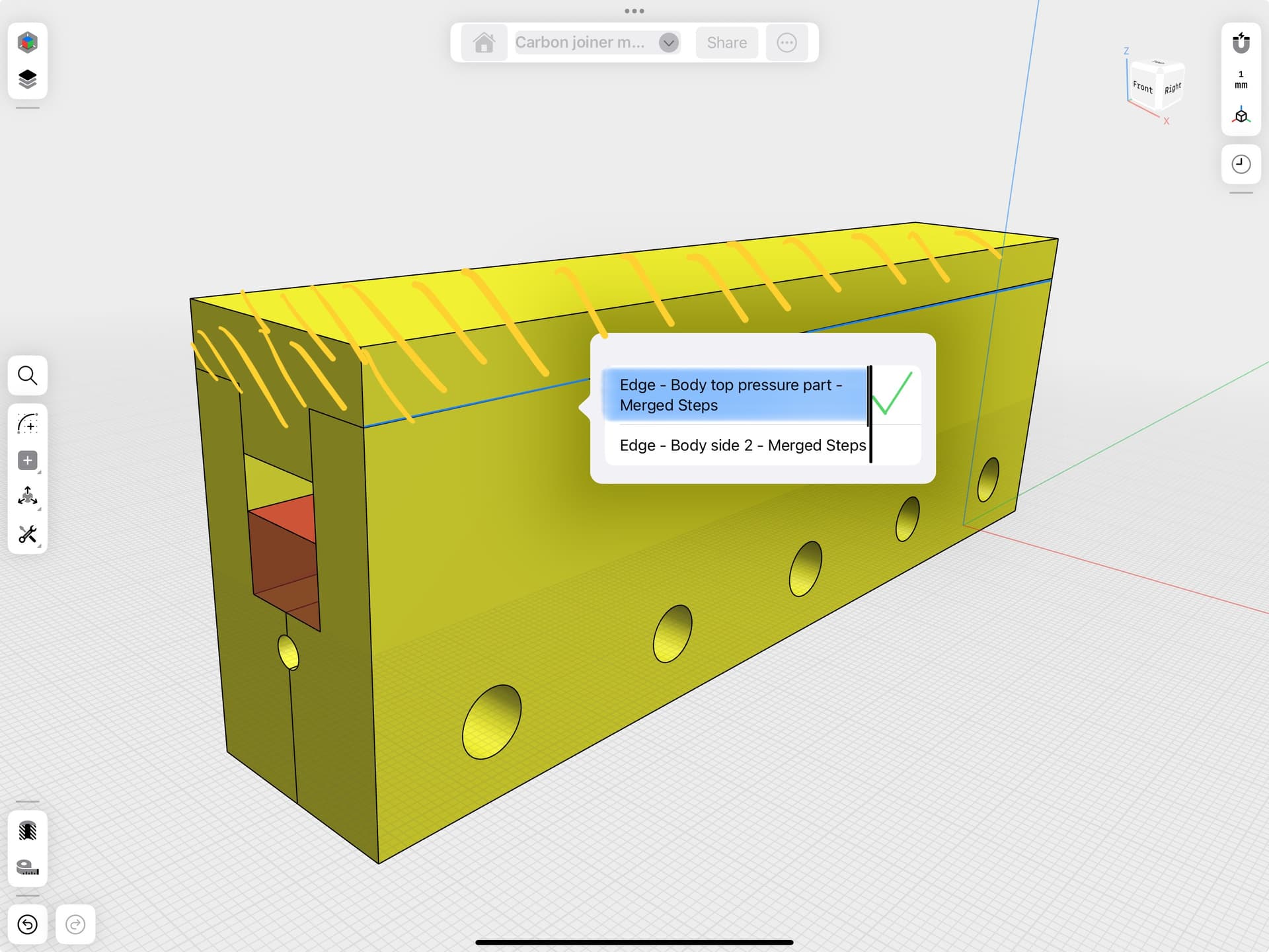
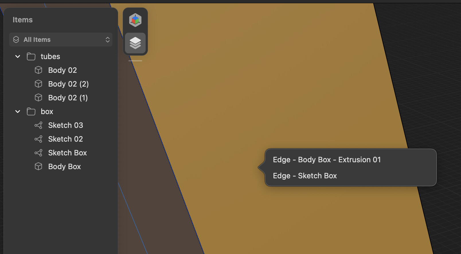
I have a little bit of problem with this one as well, however I do see that it could have advantages when zoomed out trying to select edges however, they should have it highlight the edges in separate colors so you know exactly which one you’re selecting rather than just clicking one and hoping you get the right one
On an iPad, I could imagine that if I clicked on the row in the pop-up panel, it would be highlighted in blue, and the corresponding edge would also be highlighted, and the tone of the body associated with the edge would change (e.g. become lighter). If I got it right, I would check the end of the row and I’d be done. If my choice was not correct, the panel wouldn’t disappear, but I could start the selection again by clicking on the next one. I can’t imagine how that would work in sketch mode…
I didn’t show correctly, the tone change in the attached image.
Hi, my recommendation for the desktop, more bolder colors for the selection preview currently it’s very faint. Also mouse wheel cycles through the selection preview.
On the iPad something more skeuomorphic and simple the endless dial or the digital crown. You can sync your Apple Watch for that. You could also consider some Apple Watch integrations.
I completely agree with many of the points raised in this thread. Shapr3D should keep improving, but I believe those improvements should focus on giving users more control over how they interact with the interface.
In this case, I think the selection pop-up should be optional. Previously, the app would try to intelligently select the most likely edge or line based on context, and that made the workflow feel faster and more fluid. If it guessed wrong, I could simply hide a body or adjust my view, quick and effective.
Now, being forced to manually confirm the selection every time slows things down and adds friction to something that used to be intuitive. I understand that this new method might help in ambiguous cases, but for many users, it interrupts the natural speed of modeling.
Shapr3D was built around the idea of smart suggestions and a streamlined experience. Adding this kind of forced interaction moves away from that principle. So instead of removing the previous behavior entirely, I’d suggest allowing users to choose whether they want the automatic selection or the pop-up.
A simple toggle would preserve flexibility and keep the app feeling intelligent and responsive, for everyone.
I do not think previous selection process was based on intelligence, its based on what we created last. If they deployed some machine learning and recorded what I keep doing over time to give me my predicted result! It sounds nice but I would still want to turn that off.
So a normal human being do not think of all this logic stuff while in a normal workflow. We see things and fix it, in this case by hiding while it sound dumb on paper it works. Popup in general are an annoyance, its like those notification that distract you.
I do not think previous selection process was based on intelligence, its based on what we created last.
That’s why it used to work so well in the past. 99% of the time, we wanted to select the thing we were just working on. The program gets more and more clunky.
Ah, well, that actually makes a bit more sense than what I was thinking I seriously thought some higher force was just picking the right edge for me.
But the issue still remains. the pop-ups are very annoying, they kill the concentration you’re having at that moment. I really think they should be able to be hidden by default, and only be called up if the user actually wants to
I keep on praying exactly this since a few years. There are so many sudden, radical changes. Many of them could just be enabled/disabled by a settings-facility. But no, it’s just like they where saying “These Aren’t the Droids Your Looking For” - or in other words “This is the feature you have to use!”.
I agree, I found this new ‘improvement’ really aggravating.
A better implementation would be, if you are only adjusting faces, then there should be an option to globally turn off edge selection, so that the mouse pointer doesn’t constantly select edges and what not. Or vice versa-- if you are adjusting edges only and maybe adding fillets or chamfers, then switching off plane selection would prevent the mouse from inadvertently selecting faces etc.
This “feature” is the worst thing yet. I get what they’re trying to do, but imagine this scenario: I have am looking from the top view perspective, and I’m looking at a cube. All I want to know is the width of the cube, but when I click on the edge, it asks me which edge I want, even though the edges are identical. I very rarely need to care which edge I’m clicking on, and if I did, I would rotate the perspective to click on it anyway.
Of course, now I’ll hear how people like to learn new things and they learn things easily and that I hate developers, but all I really want to do is click on a line and see how long it is without a popup. I think it’s becoming more and more obvious that they are just adding features so they can get bought out, because this makes no sense.
Hi all,
Sorry I don’t agree with all of you.
I am a product designer and I often carry out complex projects.
This function is very useful to me. To take full advantage of it, you must first name the items correctly.